Alfonso Baqueiro Bernal
Typography

Font families
Sans serif typefaces
- Baskerville (1757)
- Futura (1927)
- Nobel (1929)
- Gill Sans
- News Gothic
- Trade Gothic (1948)
- Franklin Gothic
- Univers (1957)
- Helvetica (1957)
- Univers (1957)
- Gotham
- Garamond (1989)
- Meta (1991)
- Didot (1992)
- Thesis Serif (1994)
- Mrs Eaves (1996)
- Verdana (1996)
Project:
You can create a Business Card using only letters and typography, go and try it!
Lingo
Tracking, refers to spacing between letters, is good for Uppercase, it makes stand out its square nature, looks terrible for lowercase.
Kerning adjusts the space between a pair of letters, making an even effect.
Metric kerning is the space built into the typeface, the designed put it there.
Optical kerning is automatically executed by the page layout software, works better with headlines with large-scale type.
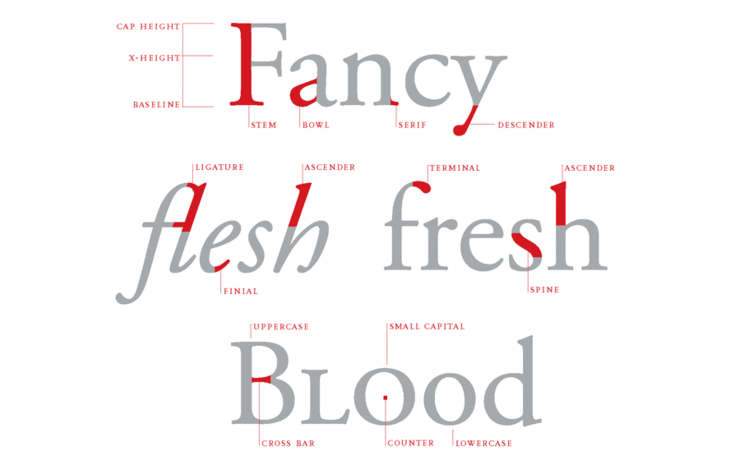
Small Caps integrate peacefully with lowercase letters.
Pseudo small caps are an averration againts nature, trying to provide small caps to fonts that does not have it.
Drop capital or drop cap is an enlarged letter, a traditional feature of book design.
Slabs is a font familiy for fonts created merging two font styles as one, Adelle is an example of this font.
Software related
- Adobe InDesign